Process Book
“Why should Beyoncé be the next headline of the Montreux Jazz Festival?”. Even though this question may seem cheeky, it presents the purpose of our visualization: reconstructing the evolution of the music performed at the Montreux Jazz Festival.
As such, we used their database to show that Jazz hasn’t always been the predominant style of each edition of the Festival. Even though this visualization was inspired by Dr Benzi’s “Evolution of genres in the Montreux Jazz Festival”, this visualization uses a different approach to show how this has evolved.
The process book that follows is a week-by-week account of our project answering all questions that would be tackled in a scientific report with the difference that it is more personal and more true to the path we followed.
As we have formed our team on the first week of class, we already had an idea of what project we wanted to do. We are all fond of music, particularly Jazz, so it was only natural that we work with the Montreux Jazz Festival (MJF) dataset the teacher mentioned throughout the course. However, our idea was far from set, let alone from being well thought out.
On Tuesday, when the teacher spoke about the project, it only reinforced our will to work with the Montreux Jazz dataset. Looking at the visualization from his website (and from the open source online MJF database), we tried understanding what data we were going to be provided.
Our brainstorming was pretty messy, to say the least, but we managed to channel this profusion of ideas coming from the excitement to begin the project to come up with a good project definition. We wanted to model the evolution of the Montreux Jazz Festival through the years because we noticed that each one of us had a different picture of the Festival in mind: Othman dreamt about the glorious days when Ella Fitzgerald, Etta James and Nina Simone sang at the MJF; Saskia remembered the “outcasts” that came like Led Zeppelin and David Bowie, while Nicolas was all about the modern artists such as Petit Biscuit and Woodkid.
Now that we had the framework, the main discussion was how to actually visualize it! For some reason, we were clearly drawn by bubbles as our main focus was constructing a graph linking all the information between them. As the drawing below is somewhat confusing, here is a clearer explanation of our idea:
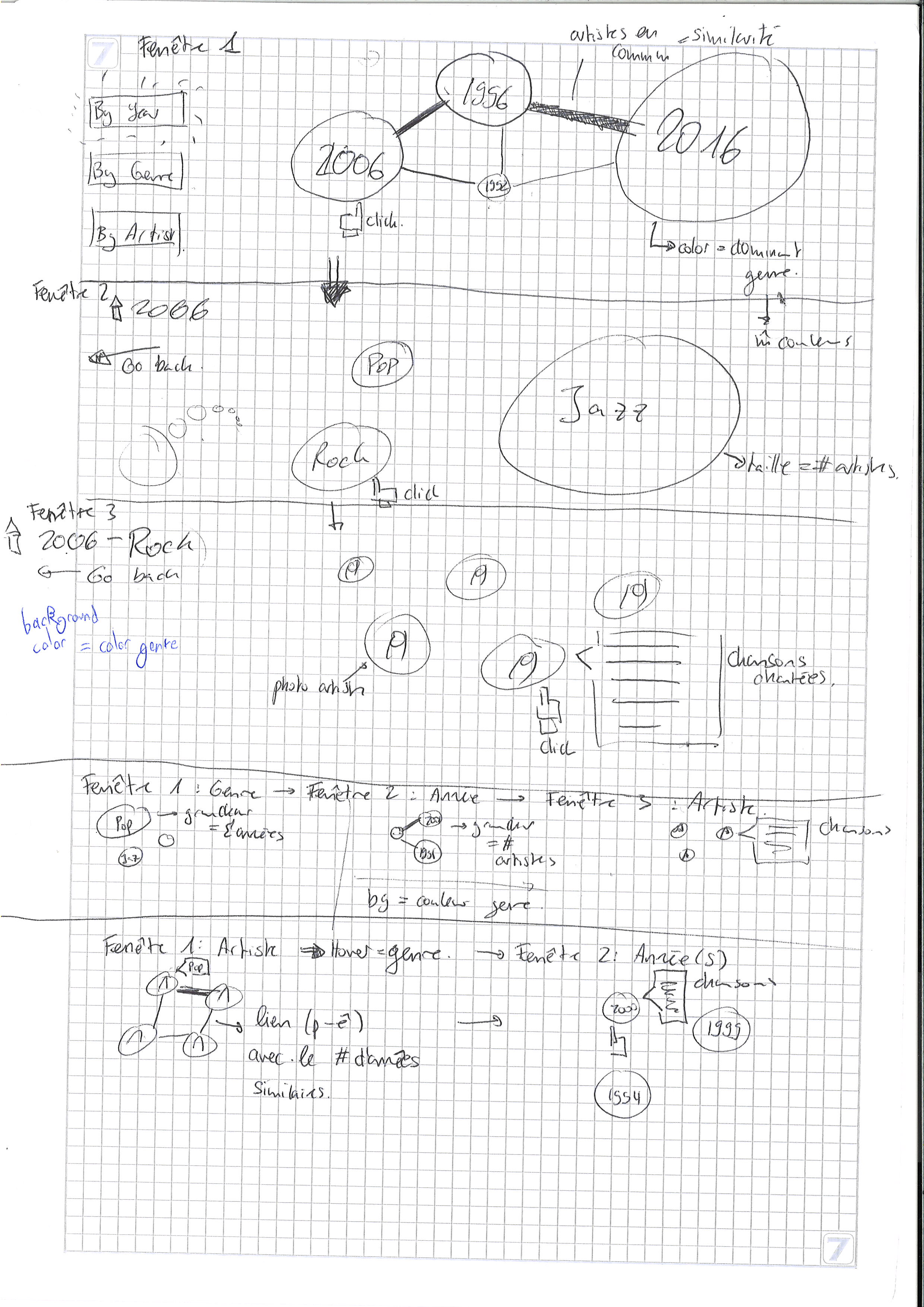 To study the evolution of the Festival, we found 3 metrics: the year, the genre and the artists. Thus, our project consists of layering these elements in different orders to have a clear overview of the changes.
“By Year”:
- By clicking on this button, the visualization starts by displaying a graph where the nodes represent the years, their color the predominant genre of the said year and the edges between the years the artists that came to these 2 editions. We use forces to position the nodes so that years with the most similar artists are placed nearby.
- When clicking on any node, we enter the second level of the visualization: the display by genre. This time, the nodes display genres and float randomly through the screen. In this visualization, the information we want to convey (the number of artists of each genre) is given by the size of the nodes. For clarity, we use the same color palette to display genres as the one in the level above.
- When clicking on any node, we enter the third level of the visualization: the artists performing the music genre at the edition specified above. Once again, the nodes float randomly on the screen. The background of the page is of the color of the chosen genre and the background of each node is the picture of the artist. Finally, when clicking on each artist, we can find the list of songs performed during the concert.
- By clicking on this second button, the visualization starts by displaying a graph where the nodes represent the genres. As explained above, the bubbles float randomly on the screen but this time, their size represents the number of years where this genre was performed at the Festival. The color palette of the genres stays the same.
- When clicking on any genre, we enter the second level of the visualization: all the years where this genre was played. This visualization stays similar to the previous one (the links represent the number of artists who performed in both editions and the color of each node is the color of the predominant genre of the year). The only difference we have is the size of the bubble: this time, it represents the number of artists which performed a music which can be defined using the selected genre.
- When clicking on the nodes, we enter the third level of the visualization which is exactly equal to the one previously described.
- By clicking on this last button, the visualization starts by displaying a graph of the artists. Even though we planned on making a graph, we thought it would be too messy so we settled with a simple ensemble of bubbles floating on the screen. Each bubble represents an artist with his picture as the background. When hovering on the node, we can see to which genre the artist corresponds.
- When clicking on a node, the second level displays all the years when this artist performed. By hovering on the year, we can see the list of songs of that year’s concert.
As we only finalized our project idea at the end of last week, we had some questions which we tried to clarify with the teacher and the assistant.
- Regarding the “By Year” part of the project, should the size of each bubble represent the number of artists which performed at the festival? For the other levels of the visualization, are random bubbles floating on the screen the best idea we could come up with? And finally, would it be interesting to represent the size of each artist’s bubble according to his Spotify popularity of to the number of people who attended the concert?
- Regarding the “By Artist” part, would it be better to color the bubble using the artist’s genre instead of displaying his picture?
We were told that the scope of our project wasn’t very realistic, especially given our idea about the transition between the different layers of the project: we wanted to zoom on each node to display the rest of the code. As we couldn’t use JQuery, it would prove to be pretty difficult. This prompted us to drop our 3-part project and only keep the “By Year” visualization which was the more informative and would be more interesting as a data story (which reminded us we didn’t have any yet, shame on us!).
The remaining of our questions had to do with the database’s format and the information it provided. As we expected to have it by the end of the week, we didn’t really ask questions about it during the exercise session. However, obtaining the dataset proved more difficult than expected as we didn’t get any response to our mail (which was probably lost in the feed, a problem that often happens even to us).
In the meantime, we started implementing the basic elements of our visualization. We mostly played with the bubbles: how to attach a name, change their color, set a picture as their background. We also tried to work on their spatial representation: how do we place them randomly? Is there any way for them to move across the screen? How can we implement a graph using forces?
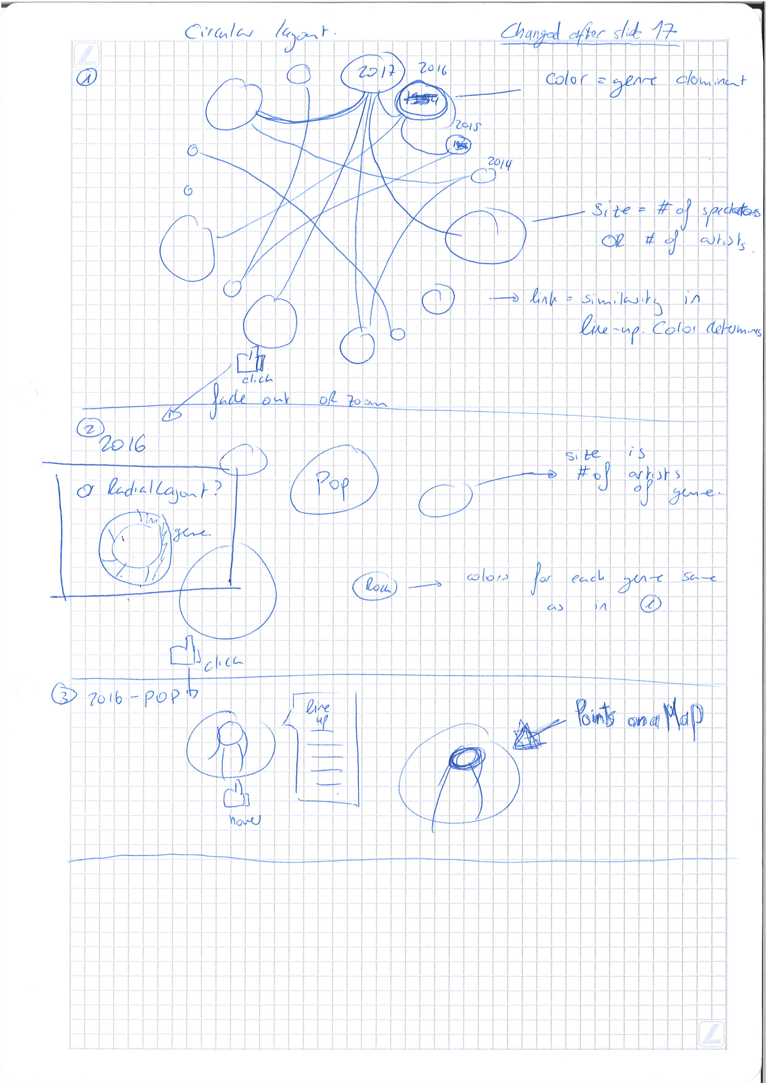
Still no sign of the MJF dataset … But this was not really a handicap this week as Tuesday’s Lecture 17 on graphs was really a turning point in our project (yes, this means we finally managed to find a data story!). You can see the drawings of our new visualization at the end of this week’s post.
One of the best ways to represent a linked graph is by using a circular layout. This is particularly interesting for us as this is what we are trying to do in the first level of our visualization. By displaying the bubbles on a circle, we have an immediate vision of the evolution of the Festival simply by looking at the color of the bubbles and their size. Even though the format of the graph changed a lot, we did not give up on using the bubbles’ color to represent the predominant genre or their size to represent either the number of artists performing at that specific edition or the number of people which attended the edition.
Regarding the second layer displaying genres, we settled for a radial layout as the bubbles did not provide any real meaning. By using the relative weight of each genre in that year’s edition, we have a better overview of the actual evolution of the MJF rather than simply using bubbles representing the absolute size of each genre as the festival is getting bigger each year.
In the third layer, we do not change the information we display in the bubbles but simply think about adding our points on a map using information about the artist’s location. However, we still did not think this idea through and do not know how hard it is going to be to implement.
Thus, this week’s work was mostly centered on how to implement the new features we decided to add to our visualization. To make sure this works, we created a (very small) fake database using the JSON format and the information we needed.
God has answered our prayers and sent us the dataset! (Well, it’s more like we should thank the teacher because he’s the one who sent it by mail). This shaped our work for the week as we spent a lot of time trying to make sense out of the data. Most of our work can be found on the Python Notebooks in the Git Repository.
After searching for the data we needed in the different JSON file we were provided, we created new clean versions of these files with the same ‘id’s to be able to use them. We first retrieved the Artists’ useful data (their ‘publicName’, ‘image’ and ‘concerts’) and Bands’ (their ‘name’). On we got all the information we needed on the performers which came to the Montreux Jazz, we focused on their songs. We decided to keep the ‘title’ and ‘songs’ from the “Compositions” file. Finally, we retrieved all the information related to the concerts (the ‘name’, ‘date’, ‘genres’ and ‘mainGenres’ of each Concert and ‘startDate’ along with the ‘concerts’ from the Concert Groups).
The task was not over when we retrieved the data as we still needed to process it. First, we processed all the dates to keep the year only (there is no need for us to have the exact concert date as we only need the concert’s edition). We then turned our attention to the concerts’ ‘genres’ and ‘mainGenres’ which we did not completely understand.
After some exploratory analysis, we determined that the first mainGenre is what really shows the essence of the music’s style. Unlike ‘genres’, this field only has a small number of categories, which makes it more meaningful. All the concerts that did not have any mainGenre and genre were marked as having an ‘Unknown’ genre. On the other hand, concerts where the mainGenre stated ‘Other’ were defined using their first ‘genre’ instead.
Almost all the data we needed had been retrieved, cleaned and processed to fit our needs for the visualization; however some element was still missing: the tracklist of each concert. We thought that was exactly what the Compositions provided as it listed all the songs. Moreover, we found out that the images of the artist were not actually provided (the field was completely empty).
After a lot of head scratching and brainstorming to try to change these elements, we determined that the missing images were not much of a problem. As we did not have the locations needed to display our bubbles either, we figured that we could simply go back to our first idea for the third level: randomly placing the artists’ nodes on the screen. However, displaying the song list was non-negotiable as it was a very important part of our visualization.
By chance, we found out that the concerts’ JSON was nested multiple times. We had no idea of all the jewels that were hiding in the file before this discovery. However, that’s a story for next week.
As we mentioned at the end of last week’s article, we discovered that the Concerts JSON file provided a lot more information than all the other files. Unfortunately, there were still no signs of images (but we had already given up on the idea by then). But this treasure came with a cost: finding a way to extract all the information that were just within our reach. In parallel, we also had to continue working on the visualization to make sure it would be completed.
Let’s start with our advancement of the visualization. As there was still no usable information, we decided to create a new set of fake data in order to work on the levels. The difference with our old fake dataset was the data format: now that we had an idea of what the information would look like and how we could translate them into JSON, we decided to create our own nesting template (which is to be used when exporting the cleaned data).
The other big step we made with our visualization was linking the different levels. As we were working on each visualization separately, it was necessary to merge our work. This was made possible with the new nested data and a little research on argument forwarding using JavaScript. Merging these levels meant tweaking them to have a coherent story but also trying to link them. This is when the “zooming part” implementation happened.
As we were already warned by the teacher, we knew we had to take some time to do research and think about a clean way to do it. However, even this did not allow us to put into code what we had in mind. We still came up with a good alternative that allowed giving a similar effect: even though we zoomed in the visualization each time to “enter the bubble”, the underlying layer wasn’t inside the bubble but was simply uncovered using a fading effect on the screen.
Getting back to our data retrieval, cleaning and processing, it was fairly easier once the data was on the Jupyter Notebook as we knew exactly what we were looking for and what we needed to do to make this data usable. Using our findings from last week, we did not find any issue with date formatting and genre definition. The only thing that took us time was coming up with the methods and algorithms to create new information.
Our first puzzle was getting the tracklist of each concert. Many ‘title’ values were null, but it seems like this was due to their extraction method. These lists were most likely compiled using digitalized video tapings of the MJF as these NaNs corresponded to applause during the concert or opening/closing speeches. After cleaning the titles, we simply put each one in a list and attached it to the concert.
The two other algorithms we came up with allowed us to compute the similarity between each pair of years (their number of common artists) and the percentage (along with the predominant) genre of each year. Once everything was finally computed and ready to be exported, we discovered that the problems we faced throughout our project were not due to the dataset not being provided, the data being hard to find or hard to get; the real problem of this project is our JSON curse!
Even after roaming through all the StackOverflow topics and reading all the Pandas and JSON documentation, we could not achieve the model we were hoping to get. So, for the third week in a row, our focus was the data we are working with more than the visualization we are supposed to be creating. As formatting the JSON file was apparently impossible, the remaining option we had was changing how we handled the data in JavaScript.
Most of this week’s work was done on the back-end instead of the front-end. Starting from the JSON files we managed to export, we tried building an appropriate approach to use them in our data visualization. After managing this task, we finally saw our real visualization for the first time! This helped us spot some problems, like the fact that we had no way of navigating through the different levels.
As this was a busy week, we did not do much more.
As the saying would go (if it existed), the final week of a project is always the most packed. We were not exempted from this rule. Now that we had completed our visualization, we went to meet the teacher to get some feedback, and it wasn’t all good. However, we were eager to hear what his recommendations were to be able to hand the best project we could.
Unfortunately, 3 days and a half was not enough to be able to implement everything that we wanted to, the example being the pictures. Even though using Wikipedia’s API to fetch the picture attached to each artist is not complicated to use, we did not have the time to implement this feature. Neither could we implement a zooming feature on our visualization because of our different levels.
However, this doesn’t mean we did not spend the week working on the project. First, we created a website to display our visualization. It was not small feat beautifying it, but we got our inspiration from the Montreux Jazz Festival’s website. This cheeky reference marked the end of our work with the MJF’s artists, editions, concerts, genres and everything that had to with this!
Having a website allowed us to implement a legend (an idea that came after the teacher mentioned not really understanding what the visualization was about when seeing it for the first time). On the same line of work, we decided to write a small paragraph at the beginning of our webpage to allow the reader understanding what all our work is about. We could go on about all the small details we implemented during the final sprint but this is probably not the place to do it.
Our final task (which was as fun as it was stressful) was the video presentation of our project. We wrote a script for the occasion and rehearsed so that we could record our screencast and the voice over together. However, the software we used caused a lot of latency. You will probably see (or read) a thousand apologies about this, but this unexpected side effect caused our visualization to look at little weird and our video to last 2:11 minutes (we argued a lot to see if it was worth it to send a video lasting 6 seconds more than the allocated time).
The most fun part of our project though was producing the video as this is when we got to choose the Beyoncé pictures we were going to show! More seriously, as our video is being uploaded to Youtube and our website is undergoing its last change to incorporate this report, we look back at the project and all agree that all of it was the best part.
This part is probably not necessary as we all agreed that this team was one of the best each member took part in. We did not have to set any rules or scold anyone as a great group dynamic naturally emerged. So, a concise answer to all four questions would be “Yes!”.